‘DYE’ a case in printing neon inks
 Printing Neon colours is a drastically different approach to reproduction and requires some experimentation and smart thinking.
With photographer Rudolf Strobl and designer Rob van Hoesel we worked on Rudi’s book ‘Dye’. The book is based on a photographic series shot at Paintball battle fields in Austria.
The designer proposed to try to print the book using neon inks. At first, his idea was to add neon colours to regular CMYK inks. The idea was to create more vibrant colours that would do justice to the strong colours of the paint used in paintballs and which those locations are covered with.
However, from my own experience with this I wasn’t expecting much of this. The printer confirmed this. So he proposed to just use neon inks for CMYK.
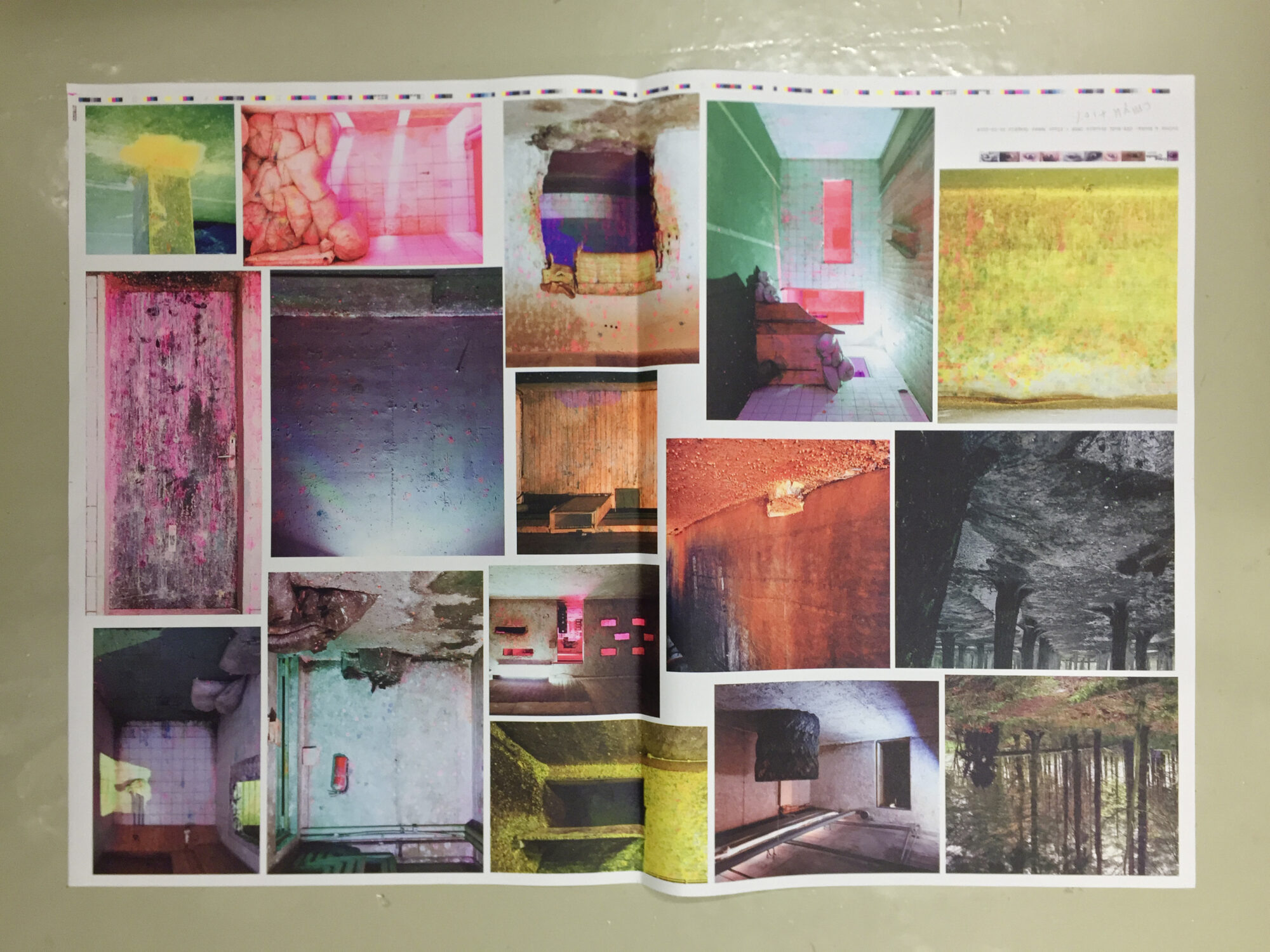
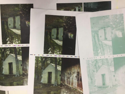 The book starts with a series of images shot in the woods. Then the scene shifts to battle fields indoors and underground. Above ground, the colours are more or less naturalistic. Once indoors it starts to go crazy. Heavy layers of orange, yellow and pink are everywhere, mixed with all sorts of ligh sources.
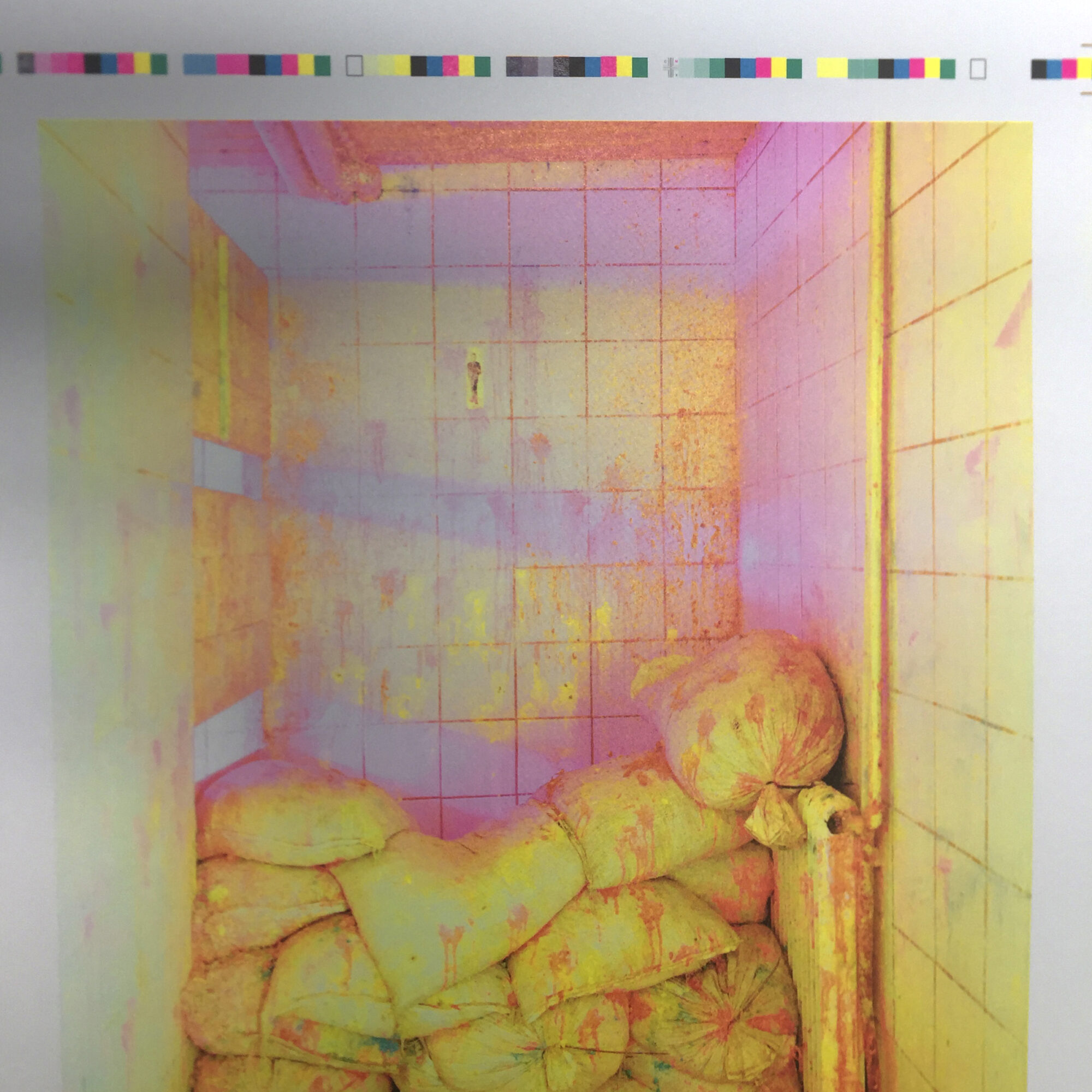
The test print I prepared was printed with the proposed neon inks. And our first impression was one of awe. Such strong and vivid colours.
I knew however, that we had to go a step further. Some of the colours, mainly the pinks, were so strong that they completely took over the images. Furthermore, it was not possible to appreciate the image itself any more. The balance in the neon images that contained the neon pink was completely lost. However, there was a lot of good in it to make us experiment more. If only we could keep those wild pinks in check.
 Diluting the neon pink with a regular magenta would probably completely destroy the effect. Like when you have a bright white ink and add just a drop of black, you loose all the brightness immediately.
So, my idea was to balance the pink with its chromatic counterpart: green. If I could create a separation that we would print with green ink as a fifth colour, that would be a way to make use of the vivid neon pink and keep it in check, therefore creating more subtlety along the way. Moreover, adding the opposite colour to a saturated section always results in more details showing up, creating more depth and three dimensionality.
For long time I was wanting to experiment with adding extra colours to reproductions in CMYK. And now a wonderful opportunity presented itself to me. Here this could really make a difference, if I where to construct the right separation for this extra green layer, that is. There was no time left to experiment with this in an extra test print. It just had to be right the first time.
I knew what I wanted to achieve. I had a fairly good idea of how this should work. And I had a printed example of some of the images in four colour CMYK neon as a reference. Now it came down to clear reasoning, focus and a bit of audacity.
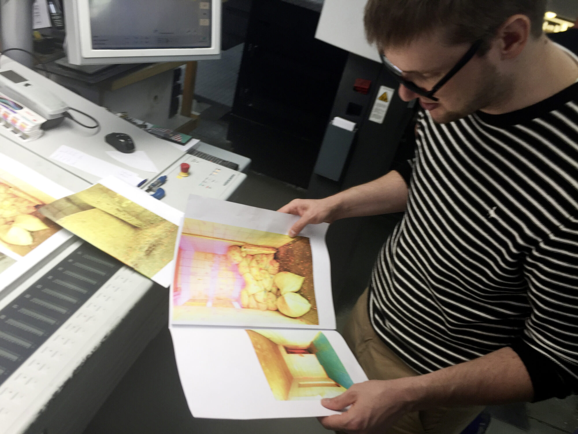
When we came on press for press checks for the final production run, I was full of excitement. Rudi had come over to The Netherlands from Vienna for the occasion. So it better be good! And it worked brilliantly. It just did what I planned for. We where able to print in a very bright colour space. With the help of this green layer we kept the pinks in check so that the images could again be appreciated in their compositions. All colours blend in with the composition to help create a sense of three dimensionality and bewilderment.
 Rudi went home a very happy man. Just one issue he has to solve now. How can he make his gallery prints just as interesting as the reproductions in his book…?