When someone says your colours look strange..
How colours look
Sometimes a comment you may get on your work could be like:
‘The colours don’t look realistic’ or ‘look strange’.
It is often heard.
And it is in itself a surprising remark.
How could anyone claim to know when a colour looks realistic or normal?
The way we see colour is purely individual.
No one can claim any absolute knowledge about this.
This is why scientists have come up with systems to describe colour.
Without a system that objectivities’ the colour we perceive, colour management systems that are so vital to us couldn’t have been developed.
Nonetheless these systems can’t describe our emotional reaction to colour and can’t define whether a colour is ‘real’ or not.
So how come people sometimes react with such statements?

It is a statement made purely intuitively.
They perceive something doesn’t feel ok in the image they’re looking at.
However, the majority of your public will not have received any training in assessing images.
They don’t know so much about what makes an image work right and what not. About balance in composition, about refined contrasts, about colour schemes, about all those little tricks we have up our sleeves to manipulate the viewer into seeing what you want them to see.
So we should not take their comment about colours to seriously. We should take very seriously that they experience something is not working convincingly for them. And since they have no other knowledge about what makes a print work or not, they will specify the one thing everybody seems to think he or she has expertise about: colour.
So what is wrong then?
It is my strong believe that you should look at contrast, at three dimensionality, at balance.
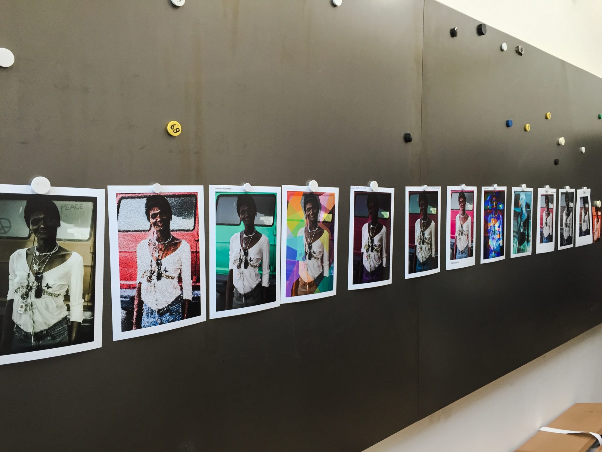
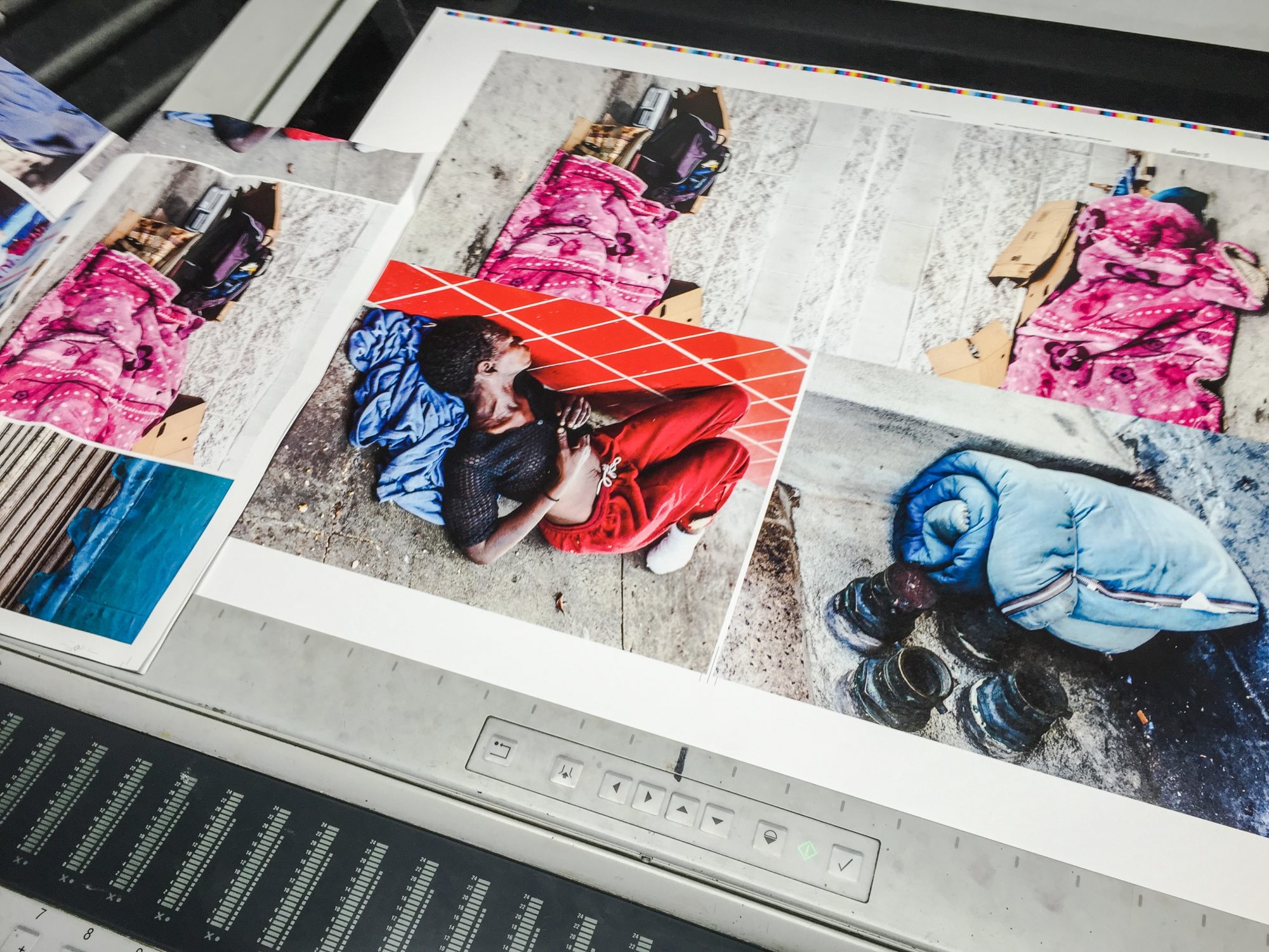
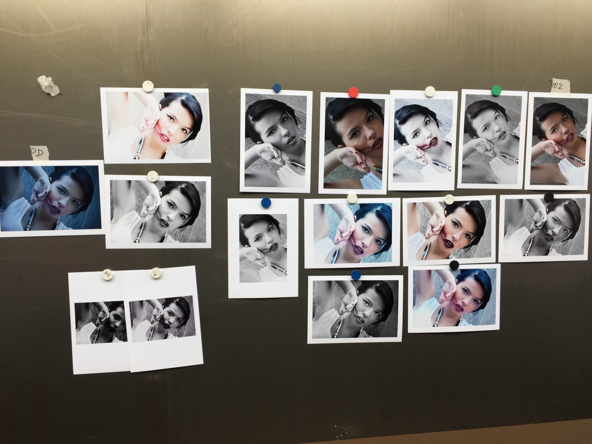
These are the tools we have to create our expression for about 80%, I should say. This is where we decide the construction of the image, where we steer our audience to focus at exactly the point where we want to. A little burning here, a little dodging there, a high lite lightly toned down and a shadow opened just so you can see the curve of a cheek. That is the trade. Of course making clever use of chromatic contrast can help you to achieve this too. And only in the last phase of developing your image you should concern yourselves with colour. In the end it is an essential part of your final expression.
My point is that if you have worked your contrasts well, the colour can be anything you want it to be. If the structure of the print is made well, your audience will perceive any colour in that image as a decision you made. They might not like a colour, sure. People have their individual likes and dislikes. If someone hates yellow, for instance, nothing can be done about that. That is not the same as commenting that a colour is not real or is strange.