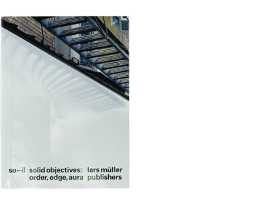
| Title | So-Il |
| Artist | So-Il |
| Designer | Geoff Han |
| Colour grading | Colour & Books< |
| Separations | Colour & Books |
| Production | Geoff Han |
| Publisher | Lars Müller |
| Printer | Artron, Shenzen, China |
| Pages | 476 |
| Papertype | matt coated, uncoated and uncoated coloured and metallic coated |
| Binding | Otabind soft cover plus dust jacket |
| Reproduction | H-UV cmyk + white |
| ISBN | 987-3-03778-501-0 |
| Year | 2017 |
The Book
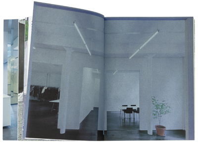
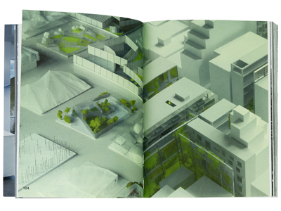
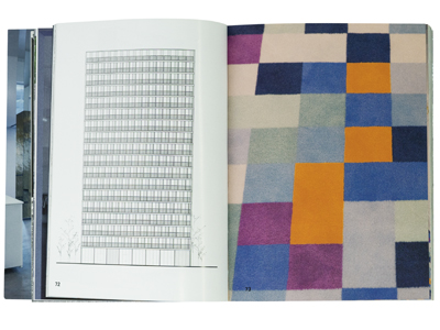
So-il is a renown architecture and design firm based in New York.The book, carrying the same name, is meant to show some of the work they have done in the past years. Usually Architects like very clear and open reproduction of their images and buildings, giving your eyes space to wander through their carefully designed rooms and objects. It is usually essential for them, because that is their job, to make you in awe of what they have created.
So-il have completed projects across North America, Europe and Asia for public as well as private clients. they want to reconnect communities to their environments and believe they can do that with their designs.
The Process
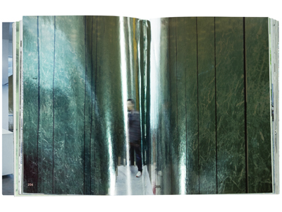
I was invited to do the separations for this book. And like I said before usually architects want a clear and open reproduction. However for this book something special was to be achieved. Some of the chapters had to be printed on strongly coloured paper, silver foil paper, or I had to add a silver ink layer to some of the images.
For example, there are some pages printed on black paper. The black of the paper would function as the black in the architectural design. This made it a unique process since the paper, ink and shine had a different function than just the material you print your images on. With this production the paper, ink, shine and other treatments are really part of the image. A complete new approach to printing and I made it work!
