| Title | Ssense magazine |
| Artist | Ssense |
| Designer | Dylan Fracareta |
| Colour grading | Colour & Books |
| Separations | Colour & Books |
| Press checks | Colour & Books |
| Production | Colour & Books |
| Publisher | Ssense |
| Printer | EversFrank Druck, Meldorf |
| Binder | EversFrank |
| Paper | UPM Star silk |
| Binding | Perfect bind |
| Reproduction | CMYK (Web Heatset) |
| ISBN | - |
| Year | 2019 |
The Book
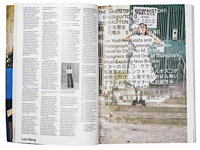
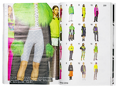
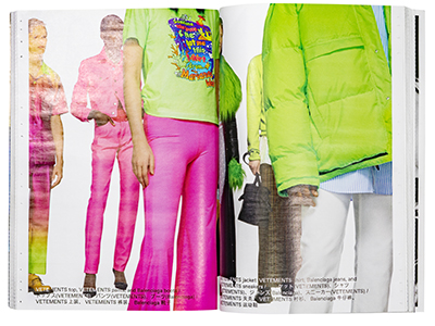
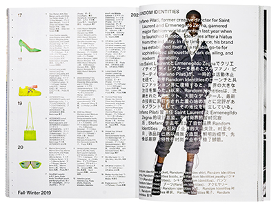
Ssense is a Canadian online clothing store that sells trendy and unique clothing for men and women. Ssense also has a space in their home base Montreal where you can physically shop. A lot of their clients are based in Asia. As of yet they do not own a physical store there. Instead they wanted to make a high standard magazine that they would be able to send around to their clients. The magazine needed to look like very high end. It ended up being a wonderful product that they will send around twice a year.
The Process
Since this was to be the first issue of Ssense Magazine we had to define the whole appearance for the object. Though I'm not involved in any of the creative developing, as responsible production manager for this volume I was closely involved in all of these steps. Finding technical solutions to the ideas that emerged, putting together budgets, looking into shipping options, sourcing materials. Also finding ways to realise some special visual effects. And finally I had to do all the image preparations and write the final production PDF. All with a keen eye on mass production within a very limited production period. After all this is fashion and new collections should reach the market asap! I had a ball, honest.
From here on following issues are much easier to produce. So much was tested and sorted out.

