How to effectively print your image, part 1
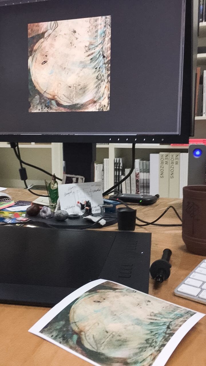 The other day I was tutoring a photographer who was completely frustrated about his process. Ever since he switched from analog to digital he lost his bearings. My promise that I could help him solve this, was greeted with great enthusiasm. We agreed that I should come and visit his studio to evaluate his process and steps and help him straighten things out. We started to work on rather fascinating images of abandoned settlements where nature had taken over. So, lots of shrub and brownish colours. Not much contrast. Mid tones galore.
The kind of images that need very precise toning to make them captivate the audience. What I saw was nothing like that. Flat, no colour, no depth, drab prints.
A defined problem
On screen the files looked way better. I asked him to compare the two: print and screen. I asked him to describe in detail the differences he saw. So I wasn’t satisfied hearing him say ‘it looks much flatter’. That is not precise. Precise is when you start to look at the details in the tonal scale and say: ‘Hey, the quarter tones flatten out. I lose contrast in that area’. Or ‘Hey, the yellow tones have desaturated and so has my reds’. Those are remarks that can help you to get an idea of what goes wrong and where you should look for solutions.
Differences between screen and prints
Now with his prints something else became manifest. He had a well calibrated screen and a screen that is suitable for true colour display. And he knew about profiles and the importance of working with those. Still the difference between print and screen was dramatically big. A print is always darker than an image on screen. No matter how well you calibrate and profile, there is a difference between light emitting from a screen and light  reflected on a surface, like photo paper. This you can compensate for before sending your image to the printer. And it is a fixed deviation between screen and print, as long as you use the same paper, same inks, same printer, calibrate well and use the correct profiles for output and input. So once you worked out precisely in which areas of your images deviations occur, you can create a default set of compensations for this.
However, if the difference between print and screen becomes so big you start to stammer trying to describe the differences, probably the profile for output, or your calibration or any other of the parameters of colour management is off.
A new perspective
So far my photographer showed a common approach towards assessing results of photography. And it always puzzled me. He, like many of his colleagues, forgot to compare the printed result with the image on screen.
That I forged him to look at this in detail, was in a way new to him. And immediately he saw how bad his print was, compared to the file. So why do so many photographers forget this? Why do they so often only react on what is to be found in the print? To be continued…….!