If you don’t want your paper to be white…
I’ve been talking about different paper types in a previous blog: coated versus uncoated and some variations on that theme. I also went over the effect paper has on the reproduction and how to balance that.
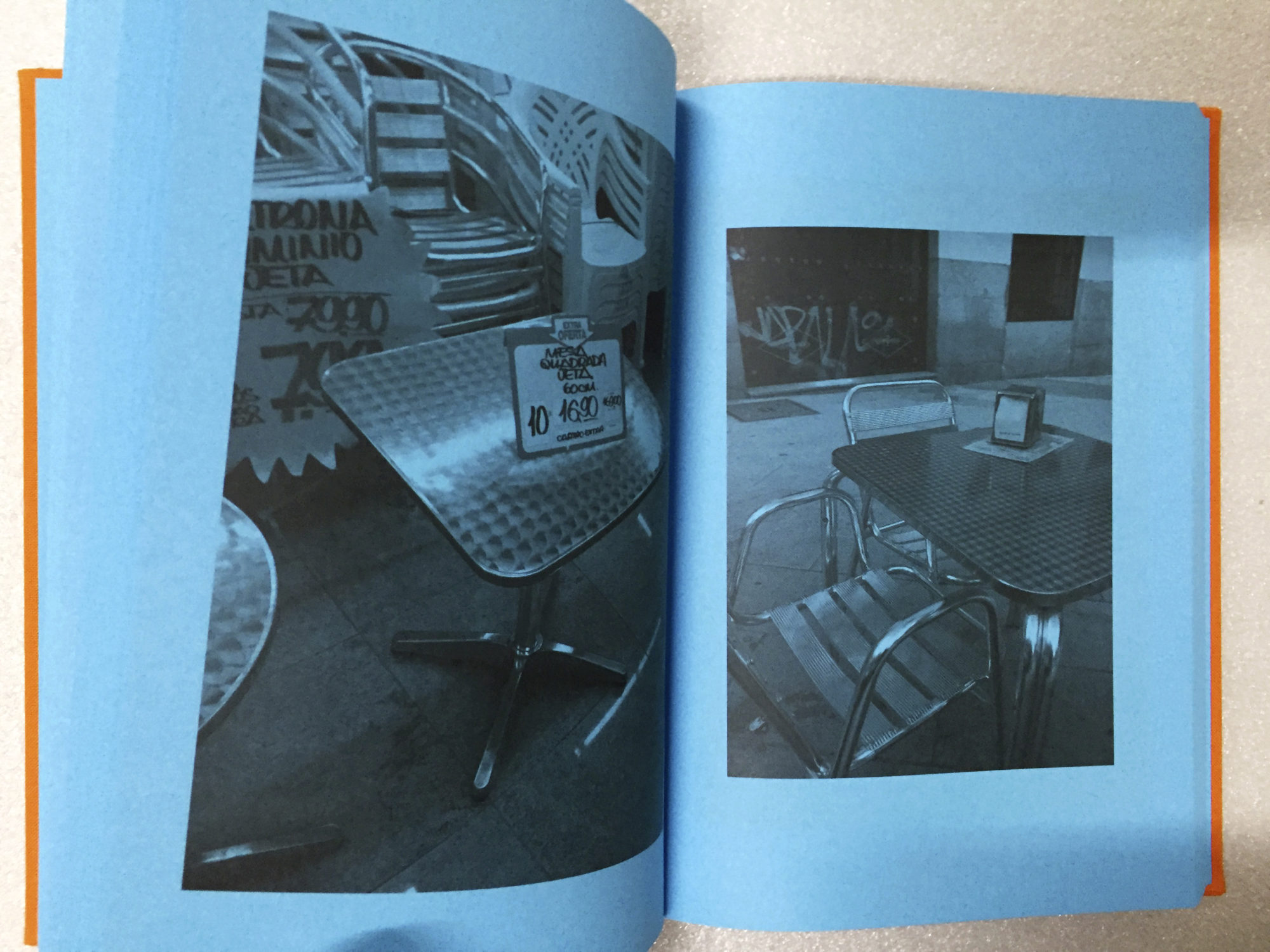
We can take the variations a step further. What if you don’t want the paper to be white? How far can you go? And what does it bring you? I’ve gathered some examples, some from the books I worked on and some I encountered.The simplest solution for changing the colour of the paper would – from the perspective of a clear reproduction of your image – be to overprint the paper with a bleeding spot colour and knocking out the image.
The image is printed on a white background where the surrounding paper is overprinted in a colour or shade. Whether you look at a print on a black, yellow, blue, grey or white background does influence the perception of that image. An image with a lot of greens on a magenta sheet of paper will look very different when placed on a white sheet of paper. It’s how our eyes work. For instance, if you print a black and white image on a white sheet of paper and give it a black passe partout, the intensity of the blacks as perceived by your eyes is largely influenced by the comparison of the surrounding black passe partout.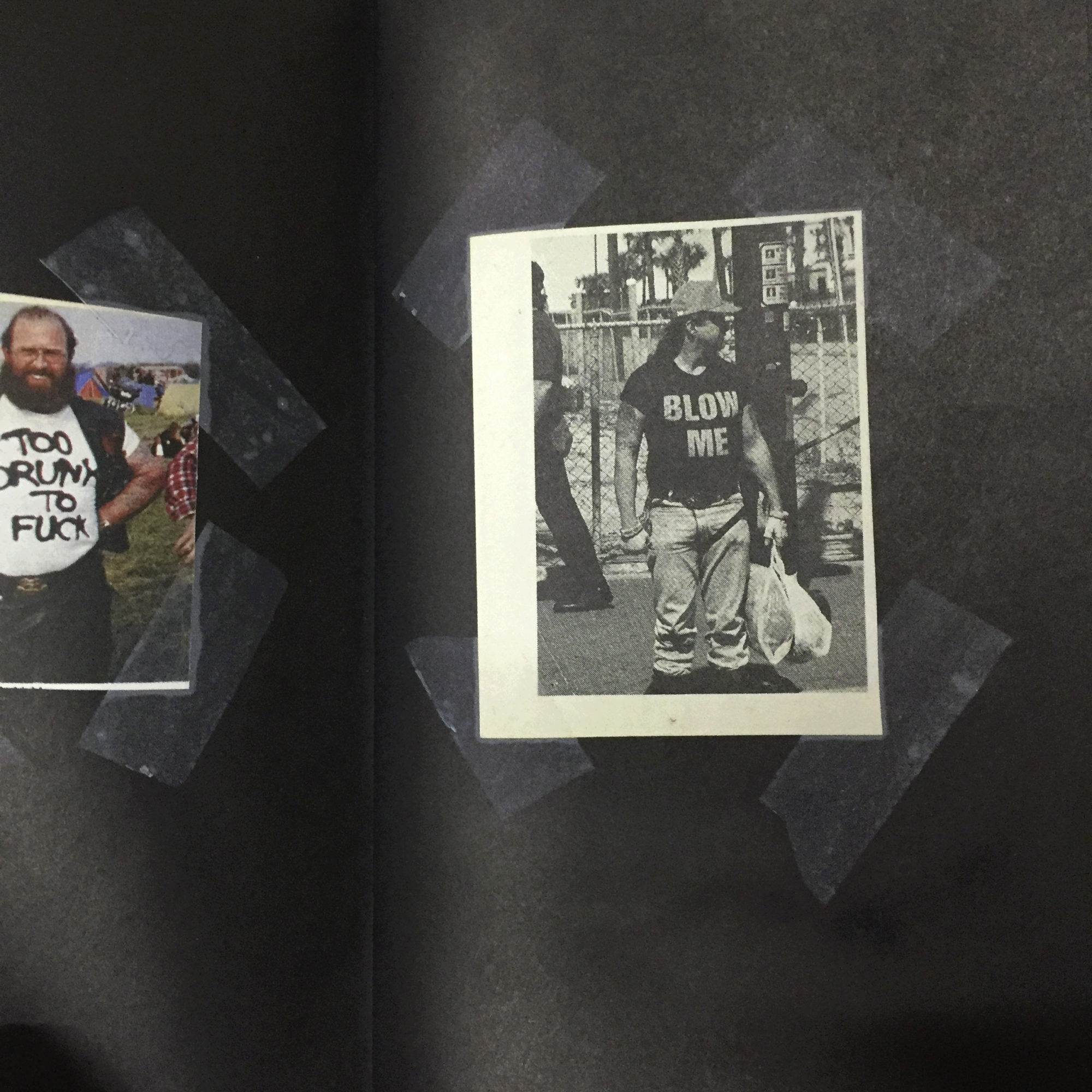
The book ‘I’d rather sleep in a hollow log’ by Dash Snow intrigued me.
It’s a solid black book printed on white uncoated stock. Beautifully printed. There is no flaw in the black and it is consistent throughout. A large number of images appear as being taped on the paper with sticky tape. And it looks perfectly natural. Looks simple but requires a lot of attention in file preparation.
More drastic is to print a colour all over the paper and then have your images on overprint. That is simulating printing on coloured paper. There could be a couple of reasons to choose for this option rather than printing on coloured paper.
One is that you can’t find the desired colour in the colour ranges of paper manufacturers.
Another reason could be that the coloured papers are prone to fade over time. Although inks have that too, some pigments are more resilient to light and will hold longer. So it is worth it to find out what will hold best over time. And of course a book that sits on a bookshelf is less exposed to light than a poster on a wall. And then money can be a topic. I know of coloured papers that cost more then a euro per sheet.
An image printed on anything else than white paper suffers from loss of contrast. The highest contrast is between black and white. Trade in the white and you’ll have less contrast.
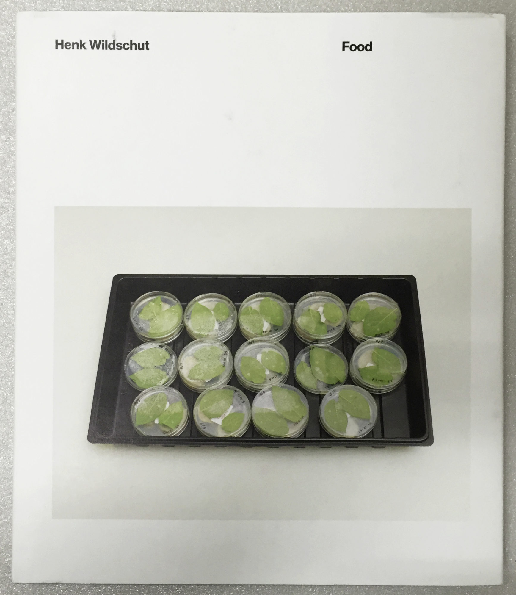
So in file preparations you should try to compensate a bit. The point is not to overdo this, so as to keep it naturally. In the book ‘Food’ by Henk Wildschut the glossary section is printed this way.
There is a green with a medical connotation printed all over the paper and the images are printed in a duotone green and black on top of it. In a test phase we experimented with different shades of green fo 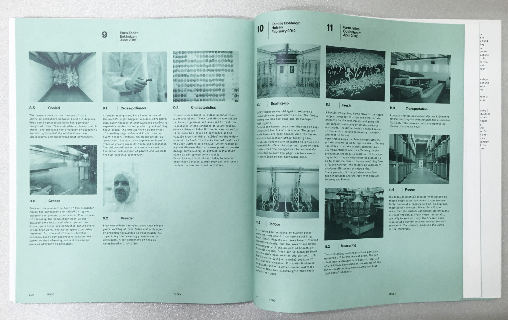 both the background colour as the green for the duotone. It is all about finding the right balance between the specific paper, the ink used for overprint (offset inks are transparent) and the inks that will print the reproduction.
There is an ever changing but fairly big choice in coloured papers to print on. Not all come in all sizes, weights or grain directions. And prices can differ considerably. Also availability at the moment you need it is worthwhile checking.
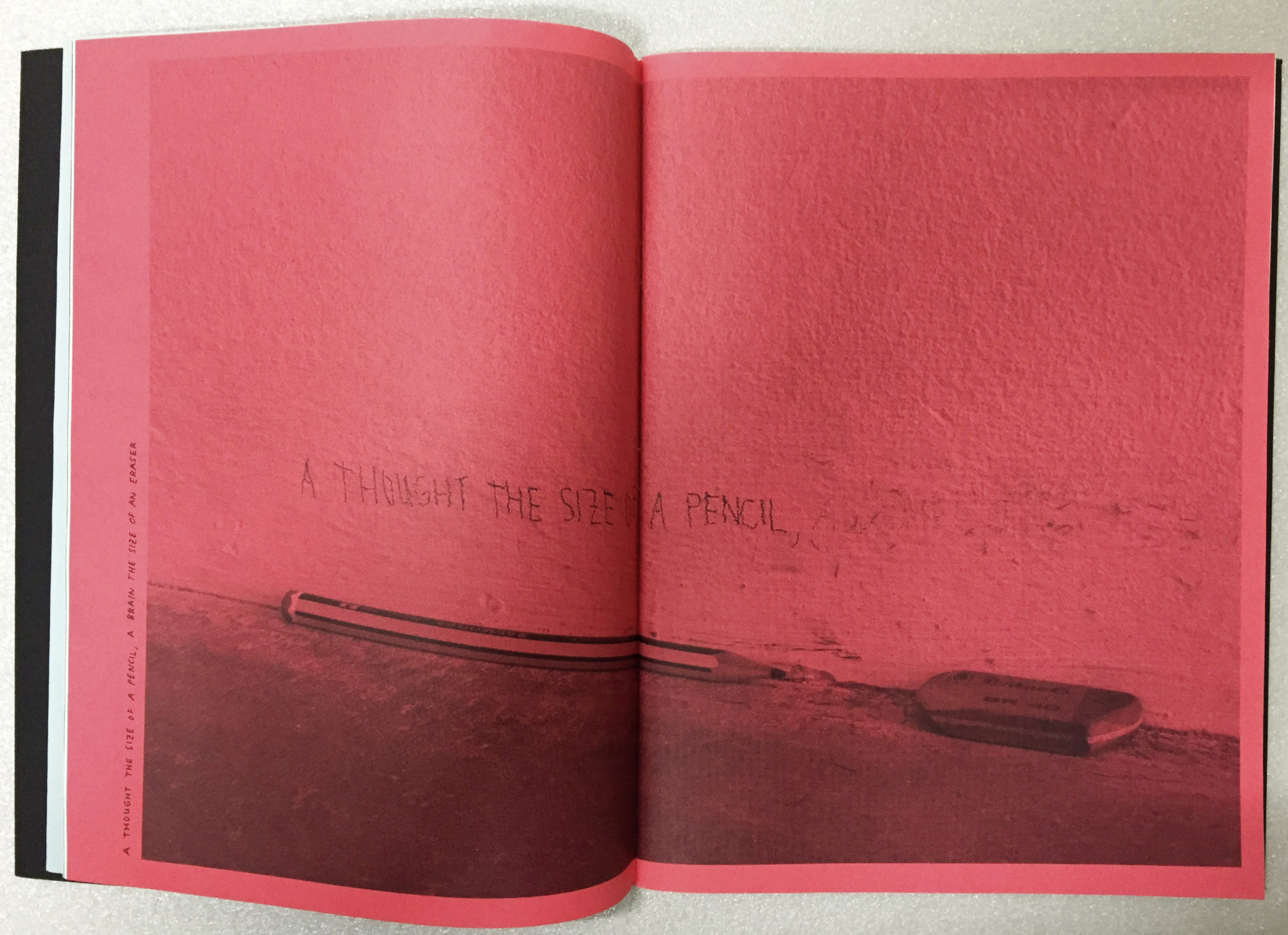
As long as the shade of the paper of your choice is still considerable lighter than the colour of your ink, there will remain enough contrast to be able to ‘read’ the image.
It becomes trickier if you want to actually print on black or very dark paper. You then will have to revert to either printing in silk screen with opaque inks:
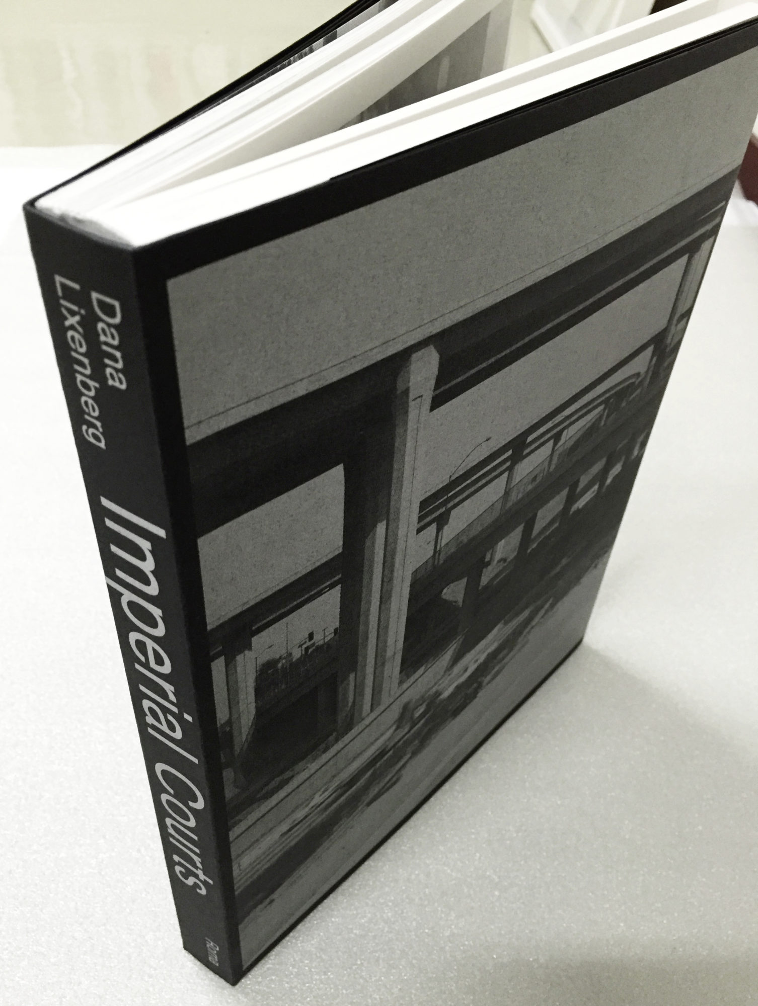
Dana Lixenberg’s ‘Imperial Courts’ screen printed in silver on black paper
Marijn van Kreij ‘o let it be’ front cover screen printed in white on black paper
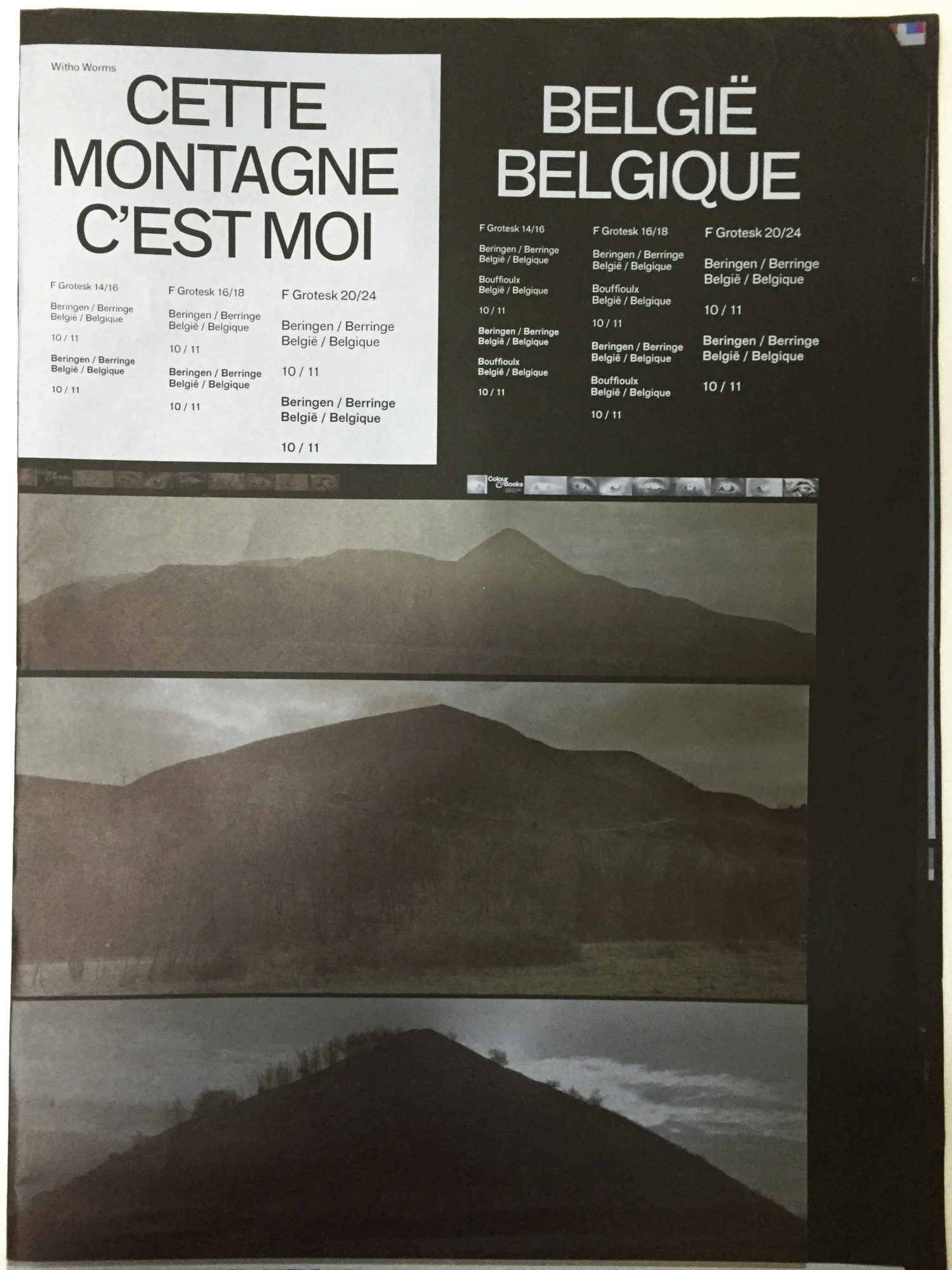
One book in which this whole idea was pushed to the limits and I had the pleasure to work on, was ‘Cette montagne c’est moi’ by Witho Worms and designer Hans Gremmen.To be able to print the images on the black pages I made a negative print run of the image to print in white as a first layer. The black of the paper thus functioned as the black in the image. Cyan, magenta and yellow where printed next and then I created an extra layer to print the brightest highlights in the image in white. We tested this by printing the first white layer in a double hit, creating actually a six colour print run. It turned out that we got too much detail that way. So the final print run was made in a 5 colour print run using only 1 layer of white for the negative.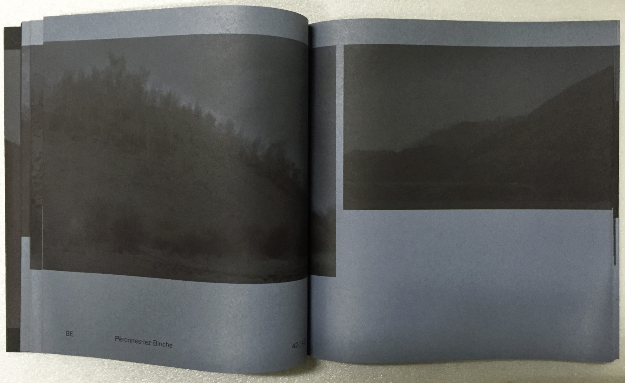
I guess there are many more variations to be made on this theme. The transparency of Offset inks mixed with coloured papers to print on… Just imagine what effects can be found there – as long as it contributes to the concept of the book.