A Story on Screens in Printing
The other day I finally ordered a copy of Mark Powers book ‘Die Mauer ist weg’, inspired by an upcoming trip to Berlin.
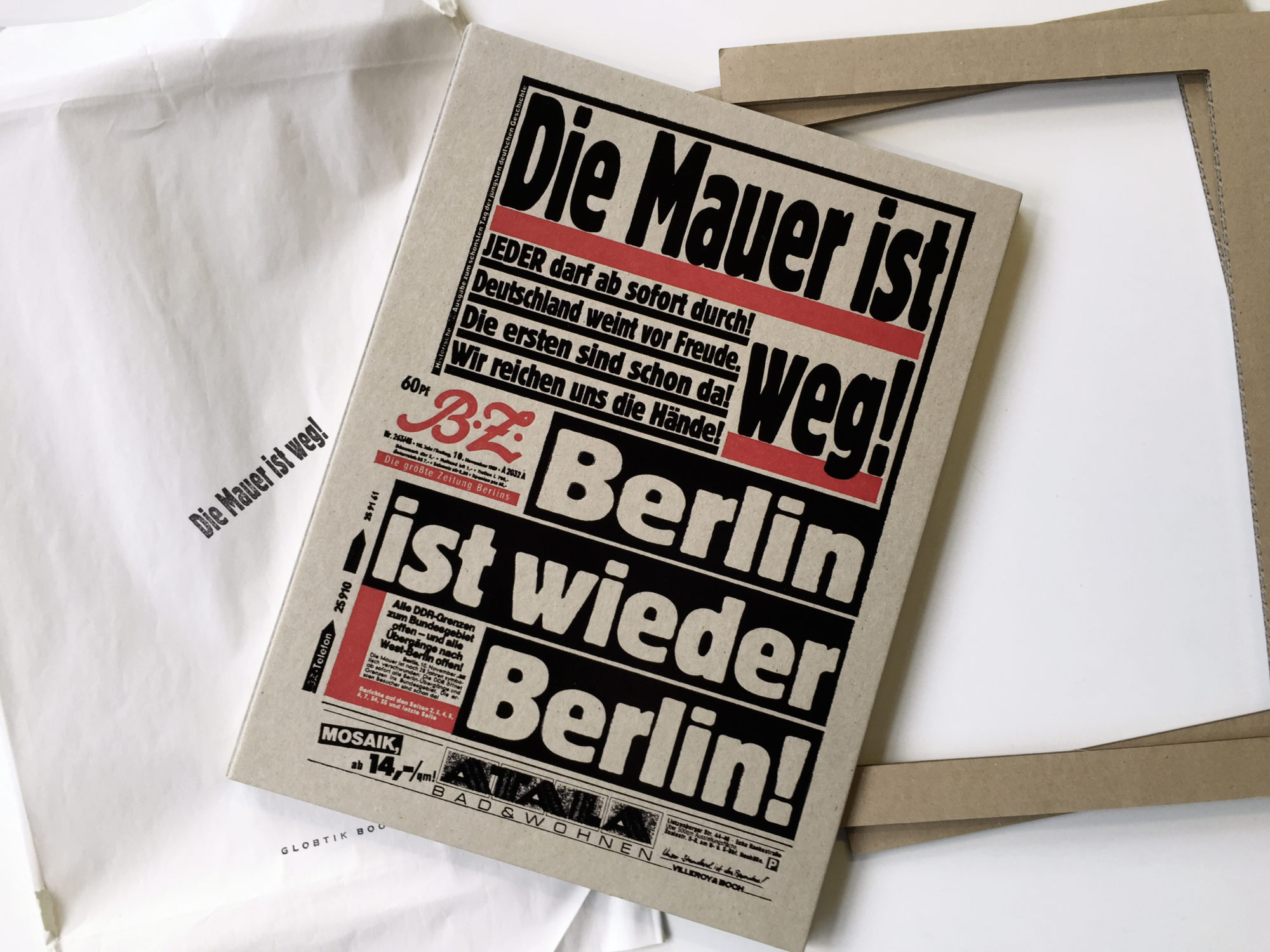 Not only a great document of the fall of the Berlin wall, but also a very lovingly and ingeniously made photo book.
The care taken for the shipping of the book tells a lot of the dedication with which this book is made. To prevent the widely extending cover from cracking, some welded board has been made to fit the gap between the book block and the overhang of the cover.
Together with the wrapping paper with DDR-look and feel and the hand stamped title on that, you’re all tuned for fully appreciating this book.
The black and white images in the book have a very distinct toning.Being a nerd about it I took a digital magnifier to see how the repro was done and I saw tritone screening. There are various ways to reproduce a gray scale image. Only using a single colour black renders you a very limited tonal range. You can extend your tone scale and your possibilities by adding extra curves, eg an extra black, a grey or a warm tone. This is called duotone, triton or even quad tone printing.
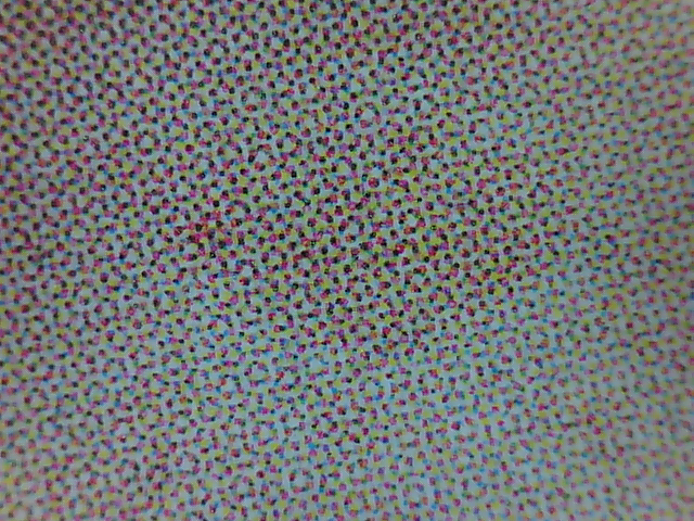 In offset we need screens to be able to print halftones (continuous grey tones). Small dots with a lot of white around them make for light tones and big dots with very little white around them make for dark tones. To combine multiple curves in one image the screens need to be grouped in certain patterns. An uneven pattern of dots creates the so called moiree effect. Lines of screen dots need to be placed in an angle of 30 degrees towards each other to prevent moiree from occurring. It is the printer who takes care of this.
 Looking at the images of Mark Powers’ book I noticed that I didn’t see the typical rosette created by dots aligned in the right angles. It looks more like the dots for the various colours have been printed in exact the same angle, so that dots of the three colours are more or less printed in over print. Now you have only half of the desired effect. You do get an extra black by printing two black dots on top of each other, but you don’t get the full extra tonal range, and the effect of the extra grey print run is severely diminished where the grey dots are overlapped by the black dots.
As I said in the beginning of this blog, the images have a very distinct toning and I am highly charmed by it, but if my observation is right, the result is created by a simple mistake of the printer, who forgot to allocate the desired screening angles to the various curves.